

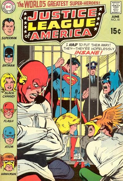
This is just one of many visually provocative covers during this period of The Justice League of America. The League locked up in an asylum makes for a dramatic image and Neal Adams seems to have done a dandy job of capturing the manic moment. But wait a minute.

This unpublished version of the cover shows that Gil Kane had done a version of the exactly the same image. It's not uncommon to find alternate versions of these classic covers, but to find one which is so very similar in nearly all respects is strange indeed. The similarity is too striking for it to be explained by the notion that both artists were given the project simultaneously, but rather it seems clear that editorial found something lacking in the Kane rendition. The only significant changes are the shifts in the heads of Batman and Flash, especially the latter. In the revised Adams version Flash and Hawkman seem to be exchanging looks filled with rage. Was that the point, to get that sense of anger more clearly on display?
Rip Off
Very interesting. I have to say, though, while the Kane cover is good, I like the Adams cover better. Flash's pose and face really sell it.
ReplyDeleteI agree, the Adams works better, but I'm startled they are so very very close.
DeleteRip Off
In the Kane version, Superman's torso doesn't look right, his 'S' is like the one Kirby drew (though it was never used at the time), the top half of his left leg looks too long in comparison to the bottom, and he looks a bit squat. Of course, they could have just had Superman redrawn, but the other factors you mentioned probably played a part in the decision to have the whole cover redone from scratch.
ReplyDelete