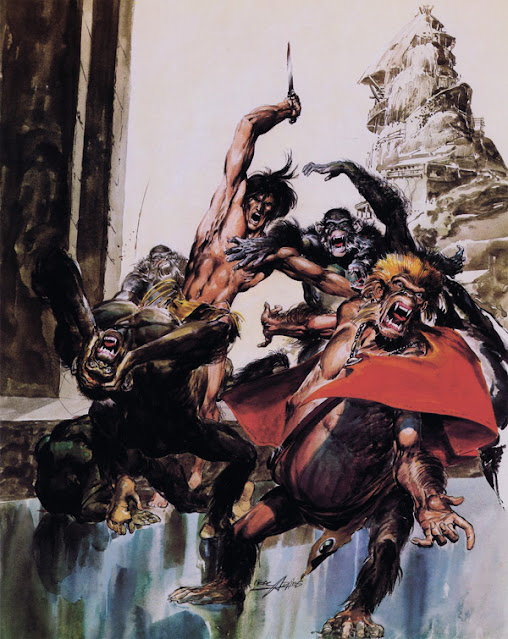

The covers above for the Tarzan of the Apes novels rendered by the late Neal Adams are without question the most personally potent images of the Ape Man I've come across. While I adore the work of Frazetta and Krenkel and Kubert and Yeates and others, it was these magnetic covers, dubbed by fans "The Black Edition", which literally forced me to give up food when I was a mere college freshman so that I could own the first six issues of this definitive paperback run.
Later of course I got the rest, and others by Boris Vallejo (more on those another time), and they are the Tarzan books I used to read the canon through the first time. I've read and taught Tarzan many times since with different editions of the books, but these are the ones I adore. While not really on model perhaps in all regards, Adams captured something of the essence of ERB's Ape Man, his exquisite blend of high romance and savagery. It's there in those pictures somehow.
I was able later to get the three Tarzan Portfolios that Adams developed out of the images. These are some of the very few portfolios I've bothered to collect up, and they are handsome indeed. But somehow the image blended with the logo makes it work even more effectively to kindle my imagination as good book art should do.
Rip Off


Interesting that you note that Tarzan isn't 'on model' 'cos that was my first thought on looking at these images. Tarzan in comics and strips always looked a bit too slender and well-groomed for an 'ape-man', which, strangely enough, was the preferred look of E.R.B.'s estate. Here, Adams has rendered Tarzan as he more properly should be, but I'm surprised the estate didn't object.
ReplyDeleteI don't know this for a fact, but I imagine the covers of the "Black Edition" sparked an increase in sales for the Tarzan books and that likely muted any objection to the Adams interpretation. Adams was at the top of his game with his comics work, paperbacks and movie posters.
DeleteNeal was on fire here. He put a lot of effort into making his Tarzan a memorable one. I think the black border greatly enhanced the artwork.
ReplyDeleteIt lifted them up out of the racks. Most paperbacks seemed to have lighter backgrounds and these paperbacks just leapt off the stands at you. Not unlike some of the poses.
Delete