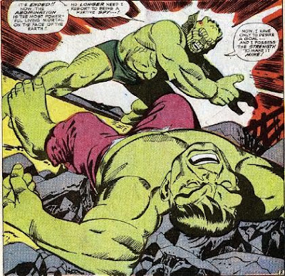
Gil Kane was a master of the comic book form. And like many sturdy talents, he had his go-to designs that he used and reused over time. One of these was his tendency to have a character, usually the hero on their back in the foreground of a shot with an enemy looming over them.

He used this a bunch, often on interior pages. The first time I can find a cover example is on the Green Lantern issue above. Carmine Infantino designed many of DC's covers, so it's likely that Kane had little opportunity to demonstrate his own design.
But when he goes to Marvel and becomes for several yeas their go-to cover guy, he started presenting this layout a whole lot. Here are a bunch of examples.


He did it for his great run of Western covers.


Here's one in which the tables are turned a bit on the attacker.

Jim Starlin was clearly influenced by both Jack Kirby and Gil Kane. In these two classics covers, his Kane influence is obvious and quite dynamic.


But no one did it with the drama of Kane.

Rip Off


Rip: Great post! Great observations about a classic Kane composition and your examples are wonderful. – Mykal
ReplyDeletePS: I have just linked the Dojo up over at my Kane blog, where I will posting an example this weekend of just the kind of composition you highlight here! http://www.kingdomkane.com/
ReplyDelete