Thursday, March 7, 2013

Cat And Mouth Games!


This powerful and dynamic cover by Gil Kane and inker Pable Marcos appeared smack dab in the midst of the Jungle Action epic "Panther's Rage" saga written by Don McGregor and illustrated at this point by Billy Graham. Graham, an artist who found his start at Warren Magazines (where I stumbled across his beautifully rendered work in my first Eerie magazine) was a distinctive and fluid artist who was more than capable of telling a story with both energy and skill.

He eventually found work at Marvel, working on both the Black Panther series as well as Luke Cage, Hero for Hire. Graham was a black man, and evidently it was thought an African-American could bring an authenticity to black heroes and their worlds that creators of other ethnic backgrounds might lack.

Unfortunately this thinking did not apparently extend to covers, as Graham produced precious few of those for the books he worked on. Here is an example of what he could do.


I'd imagine this cover was rejected because perhaps the Panther figure is too small relative to the T-Rex which is about to munch down on him. Whatever the case, it seems a really potent image nonetheless and it seems odd that Stan or whoever was in charge at that moment would go to the trouble to get the ubiquitous Kane to kick out another. But they did, and typically he did his usual bang-up job. We have two really dandy covers for one comic.

That aside, the the notion that Billy Graham worked pretty much exclusively on black heroes might've been a good way for him to find a foothold in the company, but that the "House of Ideas" rarely found a place beyond that "ghetto" for a talent of Graham's ability seems an utter waste.

Years later, he'd make another good impression on comic fans when he  teamed up McGregor again on the Eclipse Comics series Sabre, yet another black character. Maybe Graham only wanted to work on such heroes, but I seriously doubt that's the case. Graham passed away in 1999, though that date is in some question.

Billy Graham could've drawn a wonderful Hulk or Sub-Mariner story. It's too bad he didn't get the chance. 

Rip Off

Wednesday, March 6, 2013

Savage Wonder!


Here at last is a really good look at Joe Devito's cover for the upcoming Will Murry pulp adventure pitting the Man of Bronze against the Eighth Wonder of the World. The blending of these two universes is completely logical in so many ways as I discussed here a while back. I'm eager to get my mitts on this one and scour this clash between Doc Savage and King Kong from cover to cover. Should be soon. Here is a peek.

Rip Off

Tuesday, March 5, 2013

Fantasma Fantastic!


These Phantom covers from Brazil are simply stunning. I stumbled across these and fell utterly in love with this primitive, wood-cut style of art on Lee Falk's Phantom. It's at once arresting and attractive. The elegantly simple design of the Phantom makes this kind of experimentation possible and ultimately successful. Album Do Fantasma from EBAL (Editorial Brazil-Ameria) debuted in 1979 and lasted a mere five installments. Here are the covers of the other four issues, all in the same utterly compelling style.


The artist is A. Monteiro Filho. The covers are the only original material here, as the interiors of these issues reprint vintage Lee Falk and Ray Moore comic strips. Outstanding!

Rip Off

Monday, March 4, 2013

Out Of The Holocaust...A Hue!


Roy Thomas explains in his essay in the Captain Marvel Masterworks how he was responsible for a few key elements of Captain Mar-Vell's costume design. Roy says he suggested the good Captain wear a ringed planet design on his chest, an idea he's still proud of. But less proud is he that his suggestion of  the distinctive green and white color combination won the day. I like it, but Roy seems to think it an error in judgment.


So to did the folks at Yaffa Publishing Group in Australia, because on this reprinted Gene Colan cover they sure don't cleave very close to the original in terms of hues. The Kree Captain goes from a low-key green and white to a much more vivaciouis purple and red. Most likely the folks down under didn't get any proper color keys to the character as they color him correctly in later publications.


The same thing happened with this early Avengers cover which reprinted Jack Kirby's dynamic face off between the Assemblers and the Space Phantom.


Giant-Man's had some different costumes over the decades, but nothing quite this ugly, I don't think. The editors get the others characters mostly correct, though they seem more than a bit confused by Iron Man and the pseudo-Hulk, but they don't seem to have ever seen a full-color Hank Pym.

Sigh.

Rip Off

Sunday, March 3, 2013

Marvel's Space-Born Artist!


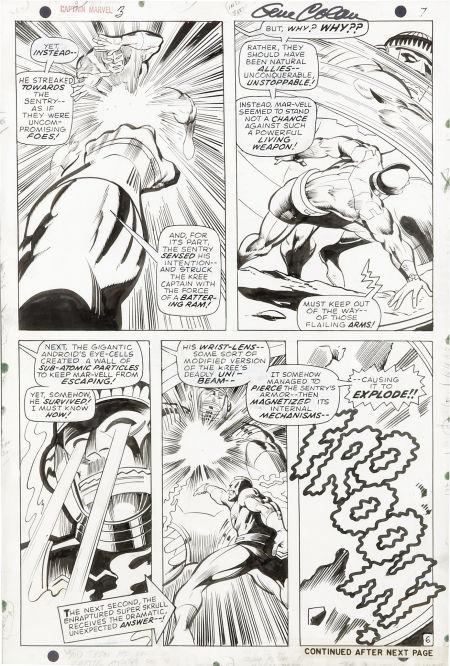
Gene "The Dean" Colan at the height of his powers was a compelling comic book artist, able to blend mundane reality with the utterly fantastic in a way which made you believe. His layouts were sometimes arcane, but his ability to draw real people was nearly unmatched. Here we have sundry examples of his work on Marvel's Space-Born Superhero, Captain Marvel. Vince Colletta, often derided and dismissed, really brings out the the best in Colan in these samples and adds a necessary snap to the pages.


 Mar-vell-ous stuff indeed!

Rip Off

Saturday, March 2, 2013

Marvel's Space-Born Masterwork!


This little volume called out to me from the shelf, demanding to be purchased and brought into my home, to be read, read again, and cherished. I simply adore the Captain Marvel character. That adoration is no doubt to a degree the result of nostalgia. Captain Marvel was my first "favorite" comic book character. I started reading him with his debut issue and continued to do so for decades.


Those earliest episodes though, the more solidly science fiction ones are my favorites. The later cosmically aware hero is dandy, but the sci-fi warrior from the distant planet Kree, a secret agent among Earth's humans, here to take our measure and deciding ultimately to fight for us against his own people, that's the guy I fell for, that's the hero I admire.

The stories in this trade paperback Masterworks volume collect pretty much all of Cap's first wave. Here is merely a Kree warrior sent to Earth in wake of the Fantastic Four encountering the Sentry and then Ronan the Accuser. For more on the Sentry see this link.

He finds himself hidden in plain sight as Dr.Walter Lawson, a man with plenty of secrets whose identity gives Mar-Vell access to some of the most powerful weapons at an American rocket base. He struggles to fulfill his mission of espionage and battle threats from the likes of the Super Skrull, the Sub-Mariner, the Metazoid, Solamm, Quasimodo, and others, all the while surviving the manipulations of his devious commander Yon-Rogg. And there's his girlfried Una too to attend to.


Mar-Vell is a man, a soldier in a faraway land who wants to be loyal to his society, but finds himself torn as the orders he is often given make little sense, seem callous and needlessly cruel. He begins to identify with the population he has hidden himself among, finding a kinship with the enemy as it were. He is a soldier in crisis, on a mission he doesn't understand, fighting a foe he doesn't hate. If that sounds screwy in 1967 and 1968 it is, and for a whole American generation being commanded to fight a spurious war in a faraway land, such ideas were potent. There's a lot to grok in the early days of Captain Marvel, that's for sure.

The series features the work of some of Marvel's best, starting with scripts by the big man himself Stan Lee, who created the character under direct orders from Martin Goodman, to monopolize the most logical name for a superhero the Marvel Universe could have. Gene Colan was tapped as artist and was inked by Frank Giacoia, Paul Reinman, and Vince Colletta. Colletta stayed on board as Don Heck stepped in to take the artistic reins. Roy Thomas had taken over the writing, but gave way to Arnold Drake after several issues. Lots of diverse hands were certainly involved in this alien saga.

It's pretty clear that Captain Marvel was a character who did not find the sales success they wanted as they began to tinker with his premise pretty quickly. The original set-up pretty much dwindles away by the end of the stories in this volume. In this one we see the alien soldier try to remain true to his oaths as well as to the basic decency this warrior of the Kree feels for us mere humans.

Roy Thomas in his introductory essay admits to the quiet echoes of Superman, an alien come to Earth and  getting some powers and living secretly among us. It's a great premise and this variation is intriguing in many ways. It's too bad it didn't yield better sales. Roy also admits to giving Cap his distinctive green and white color scheme, an offbeat look I love. Roy hates it and soon as we all know he'll ditch it for the more common blues and red and yellow.

But in this volume it's all the green and white soldier born in space. Good stuff!

Here's a gallery of the covers of the comics inlcuded included.


Rip Off

Friday, March 1, 2013

Emergency!


Here's a real gem. This Joe Staton cover for Emergency #2 is bright and exciting. I stumbled across this delightful bit of 70's gold while visiting a new (to me at least) comic book store in Bowling Green, Kentucky. There it was amid an admittedly chaotic assembly of comics, mostly stuff I own or was not really interested in. But this issue is the only issue of the original run I missed way back in 1976, so I snatched it up, haggled very successfully and brought it home in tandem with another Charlton comic I found lurking in a dusty corner.

The cover by Staton is the lure for me,  but the idea of completing this run after almost forty years is a fantastic feeling. The new comic fits in with my others perfectly in terms of condition. The interiors of this one feature a script by Charlton yeoman Joe Gill and art by the exceedingly talented Demetrio Gomez Sanchez. The Emergency comic was about paramedics, a then-new concept explored on the successful television show. Today I guess we'd call the "First Responders". It's a nice hook for a TV show and an above average premise for a comic book.


The debut issue of the run is the famous one, this one also featuring a Joe Staton cover and on the inside some early John Byrne artwork. Some artwork appropriated from the Byrne story here is used for the obligatory text piece in issue two.


After Staton's two great covers, Jack Sparling handles the remaining two issues of the run. The one above is a wonderful image, bright and focused, one of the best pieces I've seen by Sparling, if in fact it is him. I'm not so sure. It looks a lot like the style Sanchez uses inside.


This cover is more typical of his work, good and sturdy, but hardly compelling. Admittedly this is not a very good scan.


The Emergency license was used by Charlton for a color comic line as well as a black and white series. The artwork on the black and white  was produced by the Continuity Associates team assembled by Neal Adams, whose work can be seen on the first two issues. The stories are by Gill, Nicola Cuti, and Mike Pellowski.


I'm lucky to have the first two issues of this run.  But for some reason I did not find or get the last two issues of that series.


The last few issues feature some pretty good covers by Earl Norem, and the fourth issue has an Alfredo Alacala story in it. The completist in me would love to get hold of them, but I have rarely if ever seen either issue. It would be neat to finally have all of the Charlton Emergency books.


Here's a treat,  the original artwork by Jack Sparling for the unpublished fifth issue of the run. I'd put the quality of this one between his other efforts in terms of quality. The snake is sure interesting.

For  more on the television show that inspired these offbeat and oddly attractive comics, check out this link.

Rip Off