Tuesday, September 6, 2011

Fantastic Giants!

Steve Ditko

One of the great comic books of my time was this outstanding twenty-five cent 1966 masterpiece by Charlton Comics showcasing the talents of Steve Ditko. In the Silver Age, despite awesome talents galore, little was done to promote individuals.

The deification of Stan Lee was among the first. Comics were produced by nameless professionals who slogged away, some achieving a distinctive style or approach which elevated them above the crowd. Ditko coming off his success at Marvel on Spider-Man and Dr.Strange was one of those talents. His name apparently had selling power, or at least that's what Charlton, a company always on the prowl for some notion to sell a comic, believed.

One aside though -- who designed the logo of "Fantastic Giants"? It's simply outstanding!

Dick Giordano

Steve Ditko

This comic features two classic reprints, one of the debut of Konga, the early 60's adaptation of the clunky little King Kong wannabe movie starring Michael Gough. The odd numbering of the comic results from the fact it's a continuation of the numbering of the Konga series, and claims to be a quarterly comic, though this is a classic one-shot effort.

Dick Giordano

Steve Ditko

The other was of Gorgo, another British effort about two monsters tearing up London. Both are fun old-fashioned monster flicks and both make for dandy little comics under the hands of Steve Ditko's distinctive linework and Joe Gill's reliable scripting. To read the story see this link.

Steve Ditko

Two more new stories are included in this collection, two stories in Ditko's then-modern style. One was titled "Mountain Monster" and you can get a look at it at this link.

Steve Ditko

The other story was titled "With the Help of Hogar" and here is an awesome splash page from that tale.

It makes for a robust collection of comics in a day when such packages were relatively rare. Twenty-five cent comics were pretty much unheard of from Charlton and only from the other publishers as annuals usually. Marvel was just beginning to dabble in their reprints and the Tower Comics experiment was underway. But still the price point suggested something special, and this comic delivers.

For more than you could imagine knowing about Charlton's monster comics, check out this link.

One oddball final note. The splash pages by Ditko for the debut issues of both of these monster comics were later transformed into covers for the fourth issues of both series. Charlton never wasted anything.


Rip Off

Monday, September 5, 2011

The Labors Of Popeye!


In honor of Labor Day, here is a gallery of vintage King Features comics starring the one and only Popeye the Sailor Man. Actually these comics were produced by the boys at Charlton Comics under the guidance of George Wildman. They are part of a pretty big program by King Features for schools to give kids of various ages some insights into available careers of the Bronze Age.


Wildman enlisted the talents of veterans in the Charlton bullpen to get these comics done. Joe Gill wrote all of them. Wildman himself drew all the covers as well as the interiors for three issues (#1,2 & 15). Tony Tallarico (4 & 10), Jeff Keate (5 & 13), Frank Roberge (6 & 12), Paul Fung Jr. (7 & 14), Tony DiPreta (8 & 11), and Ray Dirgo (3 & 9) all did two issues each.

I've long lusted after these Popeye treasures for quite some time, and when I was finally able to add them to my collection, I was able to find more than just the comics. In addition to the comics themselves a teacher got hold of a manual, posters, and other materials such as a career bingo game. I don't have a complete kit, since there were also apparently filmstrips too, but I have a complete bingo game and the teacher's manual with all the assignments. There's a nifty wall poster too with all the Popeye covers too. That's too big for me to scan alas.

It's not feasible to scan in all of the sundry materials, since all the bingo cards are different and there are lessons for each of the fifteen Popeye comics. But I have scanned in some representative samples, specifically those having to do with commercial artwork and other media jobs. My favorite pieces are the little Popeye faces used to cover the bingo squares.

Only Bingo Card with Popeye featured on it.


Bingo Rules


Classroom Assignment

There's a neat article on this effort in Charlton Spotlight #6 which shows some photos of the Charlton plant in operation as part of this program. George Wildman is prominently featured. I've always loved his take on Popeye, it's full of energy and verve. His Popeye books for Charlton are some of the gems from the little Derby company in the Bronze Age. And these King/Charlton Career books are evidence of that.

George Wildman

Rip Off


Sunday, September 4, 2011

The Clothes Of Orion!


Jack "King" Kirby

For my money, arguably the most intoxicating heroic design that Jack "King" Kirby ever did was for Orion of the New Gods. It's one of those designs that is almost impossible for another artist to interpret, but in the deft hand of the King Orion looked sleek and dangerous, and even his peculiar helmet looked daunting. Seeing Orion charging forward astride his unique Astro-Glider is an awesome sight. The design is deceptively simple.


Al Milgrom

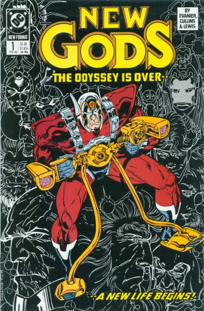
When they revived the New Gods after Kirby left DC, the design was changed. I'd imagine they wanted to evoke a more purely superheroic look and I'd also imagine other artists found the design frustrating.


Paris Cullins

Later the classic look was re-installed and Orion has looked pretty much himself since.


Mike McKone & Jose Marzan Jr.

Save for a short period in the 90's about the time Orion and Lightray were tapped to join the Justice League briefly.


Unknown

This is just an absolutely wretched design, and Orion looks more addled and scatterbrained than focused and violent, which is what they probably were going for. It's a regrettable design from a time when regrettable things were all too common alas.


Walt Simonson


At least Walt Simonson and John Byrne arrived to set things right.

Rip Off

Saturday, September 3, 2011

Where Monsters Peruse!


I stumbled across a very clean copy of The Collector's Guide to Monster, Science Fiction and Fantasy Film Magazines by Bob Michelucci. This 1988 tome purports to the be an Overstreet-style guide to these monster mags.


It's done in that style with hundreds of postage stamp cover images, mostly in black and white with basic publishing data. There's a brief color section in the middle, but mostly it's glorious black and white. It's a fun bit of stuff and I only paid five bucks for it, so no harm in taking a chance.


I was mostly attracted by the Jack Davis cover which instantly evoked memories of the classic Creepy #1 done for Warren Publications so many decades ago. It seems this was intentional as I learned when I researched the image. This link has lots of detail about this wonderful Davis painting came to be.


And for added pleasure here's the Fantasy Film Celebrity Con cover mentioned in the notes linked above.


The painting also evokes memories of another Davis cover for a mag called Lunatic Binge which I featured here earlier this year.

It's really choice. I'm glad to have it.

Rip Off

Friday, September 2, 2011

Blue Beetle Seven-Up!

Scott Kowlachuk

Here's a tasty bit of classy, modern artwork by Canadian artist Scott Kowlachuk, who offers up what Blue Beetle #7 from Charlton might've been like if it had ever existed.

Steve Ditko

This homage is a great callback to the outstanding Steve Ditko artwork for Blue Beetle #1.

Here's a link to Scott's Snazzy Sketchblog for more of his work.

Rip Off

Thursday, September 1, 2011

Rob Hanes Adventures Zero!


Yesterday after work I headed to the comics shop to pick up the fourth and final installment of the new Rocketeer Adventures. (More on those comics later.)

While at the store I was attracted by the huge stack of comics from DC. They were all this issue below.


I could've spent four bucks on this over-hyped, universe-quaking, big-name-talent-driven, by-most-reports-disatisfying, incomplete spectacle or I could take those same four bucks and pick up a heavily discounted volume of some of the earliest adventures of Rob Hanes by Randy Reynaldo.

The choice was beyond easy. Despite owning all these Rob Hanes adventures already in the original, getting them with spiffy new lettering and in a handy-dandy single volume was a guarantee of quality and classic comic book entertainment.

The other thing was less so.

Randy Reynaldo

This volume from independent talent Reynaldo collects four issues of a comic titled Adventure Strip Digest which featured the retro-styled, but still modern escapades of Rob Hanes, a young and skilled operative for Justice International, a private firm sending its agents into all sorts of scrapes all over the globe.

If you like Doug Wildey's Jonny Quest or classic comic strip master Milton Caniff's Terry and the Pirates you'll enjoy these stories. They are told with an economy and precision unheard of for the most part in sprawling modern comic books. These are tasty done-in-one adventures but still in a consistent world which does remember.

I'm eager to tear into these great stories again. As for that other comic which went on sale yesterday...not so much.

For much more on Rob Hanes check out this link.

Here's a small gallery of the issues included in the volume I bought.


Rip Off