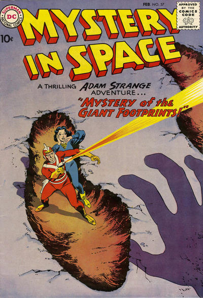
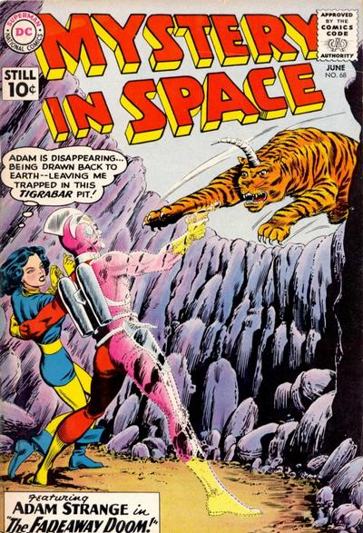
Adam Strange is one of DC's most exquisite creations. He's an Earthman who is regularly transported to the planet of Rann where he is faced relentlessly with menaces to defeat. The difference between Adam Strange and other heroes, is that he uses his brain to defeat the enemy. His wits and understanding of science are the weapons with which he defends the hapless people of Rann. He's motivated to continually solve their problems because his gorgeous girlfriend Alanna lives there. Adam goes to Rann, which is a planet 25 trillion miles away circling the sun Alpha Centaui by means of the Zeta Beam which was first sent to Earth as a desperate means of communication. My favorite parts of the stories are always at the beginning when Adam is scheming to intersect the beam which never hits the same place twice and only hits Earth in the Southern Hemisphere. Once he gets to Rann, he plants a big kiss on Alanna and then gets to work doing his hero stuff.
Adam Strange debuted in the pages of Showcase with Mike Sekowsky and Frank Giacoia handling the artwork. Gil Kane supplied some fantastic covers for the series. Adam is an archeologist but soon proves to be a polymath, knowing whatever he needs to know to battle the menace at hand.
Adam Strange then took up residence in Mystery in Space with Carmine Infantino and Joe Giella handling the art. Infantino's vision of the future is so sleek and inviting that he's an ideal artist for his series. The stories are nine pages, just enough space for Adam to get to Rann, kiss Alanna, discover the menace and scheme a solution. Nice and neat, the stories resonate with the comfort that many Silver Age stories accomplished.
A milestone was the seventy-fifth issue in which Adam comes into contact with the Justice League of America and they help him defeat the JLA villain Kanjar Ro.
The series does have a memory with villains recurring. Adam battled the Dust Devil three times, the third time is the last issue in this volume of Showcase Presents. These are delightful stories in any format, but in the case of Adam Strange bright colors are a definite asset. These are stories told in bright daylight and the colors shine. But I'm happy to have read these classics in any format. Highly recommended.
Rip Off


My one and only Adam Strange comic was Strange Adventures issue 241 (when it was all reprint), other than that I have only seen the character in a few issues of comics like JLA, Brave and Bold etc. Based on my purchases I think I like the character as a co-star rather than a solo star. I haven't read any of the DC reboots of Adam Strange , or to be fair many of these original tales ( only the odd story in a 100 pager).
ReplyDeleteAll those covers are brilliant thanks for showing them.
Those vintage DC covers demand that the comic be read.
DeleteAdam Strange is on my next-to-read pile (it will either be that or Marvel's 70s John Carter comics, whichever fits my mood when it's time to choose). I'm currently reading the classic Star-Lord TPB, which includes a couple Infantino-illustrated tales, and one thing that's been on my mind is how drastically his style changed from the Silver to the Bronze Age. His Silver Age art is some of my favorite stuff from the era: clean, slick lines; lean, graceful figures; and elegant compositions with enlongated panels that feel straight out of the graphic design style of the era. The 70s stuff is not bad, but it feels almost the complete opposite: squatty figures on cramped compositions, with jagged linework. I understand he spent many years away from the drawing table, but it feels like he was trying to deliberately avoid his classic style!
ReplyDeleteJust finished the Starlord volume, but that review will have to wait until next month. It fits in better with the theme (such as it is). The art in that tome is solid all the way through.
DeleteI liked the story and art stylings of the DC science-fiction titles. Infantino and Anderson made a great team and Gil Kane's work wasn't too shabby, either.
ReplyDeleteThe work of Infantino at this time seemed to be a vision of the future -- sleek and ultra-modern. Gil Kane's mastery of movement is probably unequaled.
Delete