Saturday, June 13, 2015

Far-Stretched!


Forms Stretched To Their Limits - Jack Cole and Plastic Man is an absolutely delightful book, as unique as any I own, at once fascinating, bizarre, and abundantly vivid.


This book published in 2001 by Chronicle Books and designed by the creative and sometimes controversial Chip Kidd offers up vintage Plastic Man comic book stories and others created by the late great Jack Cole blended in with an essay written by Art Spiegelman for The New Yorker a few years before.  You can read that essay (minus the art) here. That essay is presented on actual pages of plastic, the very stuff which gave Cole's hero his name.


Spiegekman reveals his lifelong fascination with the work of Cole, which dubs among the most peculiar and weirdly compelling in the long history of comics and a significant influence on the creators of MAD who followed him.

Spiegelman's essay follows along the broad contours of Cole's comic book career, following him from his early days in the Harry "A" Chesler shop and later over to Busy Arnold's Quality Comics line where he eventually created his signature hero Plastic Man. The success, both financially and artistically made Cole's reputation, Plastic Man made him famous.


His stint on True Crime Comics and in particular a yarn called "Murder, Morphine, and Me" made him infamous when a panel from that story became an evocative bit of evidence for Dr. Frederic Wertham in his notorious Seduction of the Innocent. That story is included here and is some relentless reading.

After leaving comics, Cole found enormous success as a cartoonist both with a syndicated strip and with Playboy magazine. But that didn't stop his successful attempt at suicide on a dusty road in 1954. The causes of Cole's suicide are unknown, and this essay doesn't answer the question, but reading such a heartfelt reflection on the life and career of Jack Cole gave me more empathy for an artist who despite success many in his field could only dream of did not find the peace of mind he needed.

Rip Off

Friday, June 12, 2015

Dr.Who And The Daleks!


Dr.Who and The Daleks is the 1965 movie which for all intents and purposes sits outside the vast canon of stories which inform the ever-growing Dr.Who universe. Apparently created as an attempt to cash in on the enormous faddish success of The Daleks, the arch-enemies of the Doctor, this story, such as it is, revolves around a future Earth on which a great war has raged leaving behind only a high-tech city of Daleks and some roaming hippie peacniks called the "Thals".


But to get there we first must meet "Dr.Who" (Peter Cushing), who in fact is called just that by Ian (Roy Castle) the boyfriend of Barbara (Jennie Linden) who along with Susan (Roberta Tovey) are the granddaughters of the doting but grumpy Dr.Who. No mention in this story of Time Lords nor that the Doctor is anything other than an eccentric old inventor who it turns out has built a Tardis (the name is not explained in any way that I noticed) which looks like a telephone box (again not explained) and which transports the quartet forward into time.


There they find the city of the Daleks, fecklessly explore it and fall victim to the rolling terrors who come in an array of bright colors. But they escape eventually after seeming to trick the Daleks, but then fall back into their clutches when a vital Tardis part is forgotten. At about this time we meet the Thals.


The Thals are a listless bunch of nomads, all sporting shiny blond hair and tired eyes. I guess they are supposed to evoke the Eloi of H.G.Wells' great novel The Time Machine, but I get more allusion to drop-out culture from them. They eventually join forces with Dr.Who and his "team" and battle the Daleks.

It's all pretty tiresome before it finally ends. There are missions and obstacles but none of it really seems to make much tactical sense and luck more than anything seems to win the day.


The story was adapted by Dell Comics and to get a look at that check this out.

This is not a very good Dr.Who story needless to say, but beyond that it's a rather tedious sci-fi effort across the board. There are a few intriguing sets and the Daleks do loom dangerously in a few scenes, but mostly the characters have to behave stupidly pretty continuously for the story to progress. It's hard to root for such boneheads, even if one of them is Peter Cushing.

Rip Off

Thursday, June 11, 2015

Mandrake - The King Years!


Finally someone is reprinting the Mandrake the Magician material from the 1960's. I've long wanted to have all of these comics in my mitts and hopefully sooner than later I will have them. Of course since we're dealing with Hermes Press here, it will likely take longer than I'd like.

Here's the solicitation:

"Mandrake the Magician the Complete King Years: Volume One  reprints issues #1 through #5 as well as the complete back-up stories found in King Features’ Flash Gordon; this reprint features the Mandrake the Magician comics which premiered in 1966 during the height of the Silver Age; cover artwork by Andre LeBlanc; covers by Fred Fredericks, Don Heck, and Andre LeBlanc; stories by Dick Wood; interior artwork by Don Heck, Werner Roth; Fred Fredericks, Andre LeBlanc and Ray Bailey; ISBN #978-1-61345-098-7; 7.75 by 10.25 by 1; full color; deluxe hardcover with dustjacket and printed cover with endpapers; 176 pages"

Here are the issues slated for the first volume. And that's a bit of a bummer since they got all of The Phantom King issues into one volume and Dark Horse did the same for Flash Gordon. But apparently we'll have two slimmer volumes for this material. 


And for no particular reason other than I like it, here's a fantastic image of Mandrake himself.


This is great news on this day especially, since Mandrake debuted on this date in 1934.

Rip Off

Wednesday, June 10, 2015

The Skylark Of Space!


The Skylark of Space by E.E. "Doc" Smith is one of those seminal works of science fiction which defined the genre. I have long wanted to sample a "Doc" Smith novel, but never got around to it. Until now.


The Skylark of Space debuted in this powerful issue of Hugo Gernsback's Amazing Stories. The story itself not only gave birth in many respects to the genre of space opera but this cover art by Frank Paul is often pointed to as a launching pad for many of the great artists and creators of comics of the later 30's. Superman himself owes a great debt to this image of the hero of Skylark, Dick Seaton as he tests his invention, a device which allows a human being to defy gravity at fantastic speeds. That's his best girl Dorothy Vaneman and his best pal Martin Crane, a fantastically rich fellow.

These three emblems of early American upper-crust society use the power of the invention to build a spaceship they dub "Skylark" and they then proceed to pilot Sklyark to the ends of the universe, skipping across the cosmos in winks of an eye. They are in contest with a decided villain named Marc "Blackie" Duquesne who is without question the most interesting character in this insane yarn.

The hardest thing to like about this story is the hero Dick who lives up to his name time and time again. One of those typically brawny types but with a brain, he scuttles around in the early stages of the story on his motorcycle with a witless devil-may-care attitude that you know is going to bite everyone in the ass. His mildly wiser comrade Martin ("Mart") throws money at any problem and never seems to question any of his decisions, a whopping number of which have grave consequences.


But as hard as the guys are to like, the girls (another one named "Peg" is added to give Martin someone to cling to) are worse. Dot and Peg are among the most vapid women I've ever stumbled across in modern fiction, apparent indicators of what proper women should think and feel, both of them seem chipper enough but depend on the men in nearly all respects despite apparent evidence they needn't do so. A huge chunk of the story toward the end is taken up with descriptions of wedding plans, as if any red-blooded American male (the target audience for Amazing Stories) would give a hoot about that stuff.

There was some input on this story in its early stages (written in the teens apparently though not published for over a decade) by a woman named Lee Hawkins Garby, who I guess must account for these feminine touches, as weird as they are. Smith gets the blame if she doesn't and the version I read doesn't mention her as co-author so I drop it all on him.

The Skylark crew set a paradigm of doughty folks flying into space to wreak adventure, that's certain. I can see the genesis of Flash Gordon here without doubt. But the dynamics between Flash, Dale, and Zarkoff are manifestly better than that presented in this novel.

I want to be fair and judge the novel within the constraints of its time, but even given that the thing reads like an antique. The prose is merely adequate moving us from event to event with sufficient clarity, but constantly discovering oddball places to linger as the action unfolds. There is action for sure, monsters, spaceship battles, and whatnot.

One big problem is that the main villain Duquesne disappears in the last third of the novel only to reemerge toward the finale without a sufficient resolution. I know we're suppose to read the next installment to find out more, but I have to say I'm not in a hurry.


The sequel is titled Skylark 3. I got it from Bison Books when I ordered the first one. So it's there to read when I can work up the nerve.

Rip Off

Tuesday, June 9, 2015

Beta Ray Bombshell!


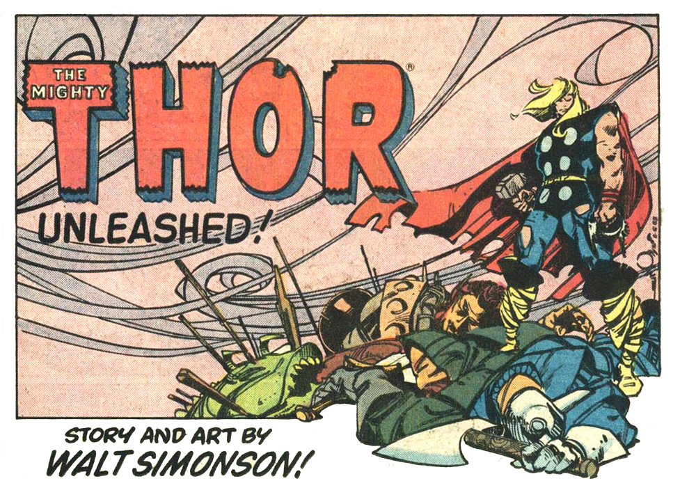
Few moments in comic lore as momentous as the one featured on the Thor cover above. When Beta Ray Bill suddenly appeared thanks to the earth-shaking changes made by Walt Simonson, it was just what the cover implies, a dramatic and abrupt passing of the old and an embracing of a new way forward.


This is the static Thor cover which preceded the coming of Simonson and Beta Ray Bill, a typical but rather bland offering from the House of Ideas. Thor was a durable read, but at that time hardly an exciting one.


Simonson arrived on the scene and all that changed and suddenly the status quo was gone and we were treated to new excitements.

Below you can see how this artistic monument came to be.


The changes promised arrived with luster and sass.


The next several years of Thor did not disappoint. I'm very happy that some of Simonson's vivacious design sense made its way into the movie Thor - The Dark World.

Rip Off

Monday, June 8, 2015

Hulk Busting!


The more I read about the Marvelmania International fan club, the more disreputable it sounds. The characters who ran the comic book industry from NYC appear at times to be downright dimwitted when it comes to merchandising their products, often signing up for deals which promised a fraction of the actual potential value of the work. That seems all too obvious now I guess, but even at the time it sounds to me like often Goodman, the man behind the Marvel empire was signing away rights for pennies, and seemed to have little interest in the quality of the craftsmanship.


The Hulk poster by Herb Trimpe has been featured here and many other places before. It's a symbol of the reckless nature of how Marvel operated in those days, taking its talent for granted and seeing the work as what comics had become, factory piece work.


Here is the now-famous original Kirby artwork for that poster, which as I understand it was clearly used as the model for Trimpe's version. Now no dishonor falls to Trimpe, he was merely a company employee doing the work he was paid to do, which like nearly all of Marvel at this time was evoking the best of what Kirby brought to the page. I actually prefer Trimpe's version of the image as Kirby's Hulk is weirdly too human somehow in the face.


But famously this poster was perhaps the last straw which sparked the switch by Kirby from Marvel to DC. Clearly he'd been planning for such a move for some time, but the actual motive to move was seeing his work so disrespected by the company he had given so much to.


This Kirby art is getting a color showcase on the next Jack Kirby Collector which should be showing up in stores any time now.

Rip Off

Sunday, June 7, 2015

The Diana Prince Adventures - Part One!


Of DC's "Big Three" - Superman, Batman, and Wonder Woman - it has always been the last who has struggled for attention. Created by William Moulton Marston, a pop psychologist with a gaggle of fetishistic interests, she has always had a weird resonance. I don't know if it's still the case, but DC had for a long time to keep her published regularly, despite a drop in popularity, or risk losing control of the character. So Wonder Woman struggled on through the 50's and into the 60's. Then a change came.


DC decided to make Diana Prince the star of the show and make "Wonder Woman" less of a thing. To that end they brought in artist Mike Sekowsky, writer Denny O'Neil and inker Dick Giordano (the latter two fresh from tenures at Charlton) and gave the Amazon a dramatic makeover, with Jack Miller operating for a time as editor. Gone was the star-spangled bathing suit and the lasso and the invisible jet and even Paradise Island. Diana Prince was changed into a mere mortal and found herself in the then modern world vivid 60's pop culture. She became very like Mrs. Peel from the British TV show The Avengers.

To assist with that change Steve Trevor was written out, and an Asian sensei named I-Ching was introduced to give Diana the skills to fight against the more realistic world she encountered. An arch enemy, the mysterious Dr.Cyber, who had killed I-Ching's people was introduced and Diana and her mentor battled against the high-tech forces across the globe. A hard-boiled detective named Tim Trench shows up to lend a hand for a few issues and the the whole brew was decidedly different.

Mike Sekowsky at work.
Mike Sekowsky's art is an acquired taste for many, but I've always liked his energetic pages and he is at the top of his game on this "New Wonder Woman" material. Dick Giordano adds a sharp edge to Sekowsky's roudy lines and gives Diana a beauty which is not frozen but vibrant.

The first volume of Diana Prince - Wonder Woman gathers the first seven issues of the revival with the first five written by O'Neil. The stories are interesting but mannered a bit, the evidence of perhaps too many interesting but divergent sources blended into the brew. With the last two issues Sekowsky takes the reins as writer and returns Diana briefly to Paradise Island to battle among mythic figures (King Arthur, Seigried, and Roland among others) to save her mother and the Amazons themselves. These two issues are wonderfully imaginative and Sekowsky's artwork is exquisite.

Here are the covers for these issues. 


More to come next week.

Rip Off