Saturday, April 6, 2013
Big John's Barbarian Cover Gallery!
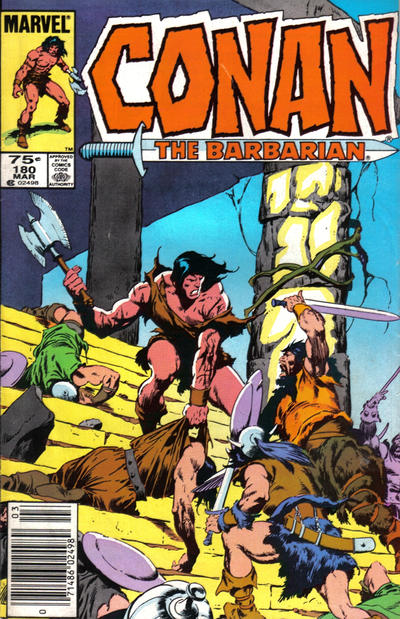
When John Buscema was named to become the artist on Conan the Barbarian it was the perfect union of a talent and a property. (Buscema had been first choice of Roy Thomas, but he cost too much per page for the untested new title, so they opted for the fresh-faced Brit Barry "Not-Yet-Windsor" Smith.) Buscema's robust and powerful lines gave the world of Conan the grounded realism it required to be taken seriously by readers. While the events might be fantastic, there was no doubt the world felt real, making Conan's struggles all the more striking and impressive.
And despite fan appreciation for the brushwork of Alfredo Alcala, Ernie Chan, Tom Palmer, and others, Buscema made no secret of the fact he preferred to ink his own work, and that he thought that made the work appear to its best effect. The cover above is an example of raw Buscema, both pencils and inks showing what he can do. Below is the artwork for that cover, even more impressive to my eye.
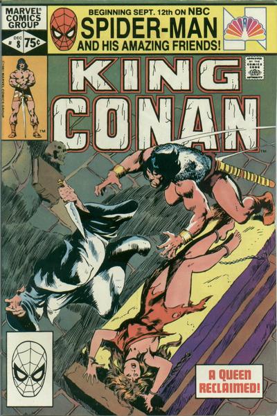
Buscema's figures have heft and weight and the composition captures the eye and the moment perfectly. Below are some more covers by Buscema featuring his own inks. Big John's own brushwork has a softness other inkers often failed to bring. Are they superior? You be the judge.
Pretty damn impressive lot I say. Better than Alcala? Chan? The beautiful thing is we don't have to choose. We get to enjoy them all.
Rip Off


It is amazing how much better Buscema's inking looks without colour.
ReplyDeleteThat's one of the reasons I fabricated this gallery, to show that very thing. There is an elegance to the black and white images which the bright colors undermine somehow.
DeleteLikely the boldness of a Chan or Alcala is what prompted editors to use them. That and it allowed Buscema to work with less detail maximizing his page counts.
Someone would be well served to offer up a collection of Big John's Conan covers sans color. They'd be awesome!
Rip Off
Steve I was looking at the b/w art and saying to myself....look at all the lost texture due to the coloring process. You nailed it.
ReplyDeleteIt's so true. There is a quality to Buscema's finished pages which goes missing. He did two issues early on in his run which he inked himself and they are gorgeous, but he just couldn't do it quickly enough to make enough dough. They should've paid him more, but he likely was getting top dollar even then, as little as it was.
DeleteRip Off
It always puzzled me that John B didn't like artists like Alcala inking his work. For the B&W mags, it gave the art a whole new dimension. I will admit 'though, that his self-inking on Conan is far better looking than on his FF.
ReplyDeleteBig John always came across to me as bit cantankerous generally, so his complaints are always seen in the context for me. As for Alcala, as lush as it turns out, it does look sometimes a bit more like Alfredo's work than John's, and that might've been a stumbling block. I love the ultimate pairing, but perhaps Buscema saw his work being disrespected. He usually favored inkers like Giacoia, rougher types.
DeleteGenerally his loathing for superheroes, as many as he did, is revealed when compared to the quality of his Conan work. He was at heart a working stiff, so he likely would've stayed in the game, but you have wonder if Buscema would've walked away from comics all together if he'd not gotten the Conan assignment ultimately.
Rip Off
#123 is either Dan Green or most probably McLeod. Inks are just a bit too slick for JB. The cover to #180 is just magnificent and totally ruined by a horrid coloring job. I owned #119 at one point. Truly gorgeous. Nobody beats Big John Inking Big John.
ReplyDeleteWell, oops. I checked with Bob McLeod and apparently John DID ink 123, though Bob sees it as being odd looking as well (so I'm not crazy). Still, my mistake. :-)
ReplyDelete