
These "giant" specials were a real treat some years ago when DC felt like doing that sort of thing. They published several neat packages of entertaining comics, none more so than this one featuring the artistic elegance of Jerry Ordway. The inset of The Spectre in the logo appears to be a Jim Aparo image from Adventure Comics #431..

Here's a look at Ordway's artwork minus the copious cover copy. I love it, but there's something about the overwhelming copy on the ultimate cover which gives it a frantic energy. Ordway definitely knows his stuff.
Rip Off
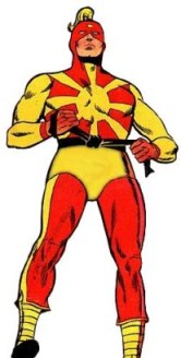
The GCD lists the reprinted story as "miscoloring" the Spectre green and white instead of the blue and gray shown in More Fun #52 and 53.
ReplyDeleteI liken the editorial decision to use his better-known green-white color scheme to the same reason The Hulk was usually colored green in reprints of Incredible Hulk #1 (1962) instead of grey (until they made the gray coloring a major plot point in the 1990s)...it's more identifiable to the audience.
(and odds are the change was made back in 1940 because the blue/gray scheme matched Batman's!)
This is a comic I can buy?
ReplyDeleteBritt - Good info! Thanks.
ReplyDeleteMikeyboy - Yes you can! These packages from DC were very sweet.
Rip Off